📢前言
代码取自开源项目50projects50days,用作个人学习和巩固三件套的知识,增加了注释,可能会有小改动。
在线演示地址
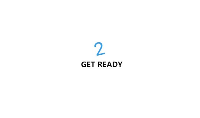
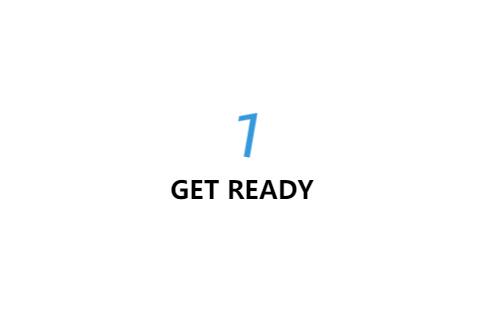
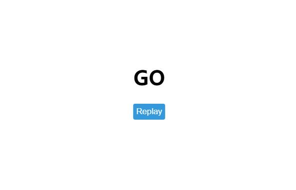
📝实现思路及效果

💻代码
index.html
1
2
3
4
5
6
7
8
9
10
11
12
13
14
15
16
17
18
19
20
21
22
23
24
25
26
27
28
29
30
31
32
33
34
35
36
37
| <!DOCTYPE html>
<html lang="en">
<head>
<meta charset="UTF-8">
<meta http-equiv="X-UA-Compatible" content="IE=edge">
<meta name="viewport" content="width=device-width, initial-scale=1.0">
<title>倒计时动画</title>
<link rel="shortcut icon" href="../logo.svg">
<link rel="stylesheet" href="style.css">
</head>
<body>
<div class="counter">
<div class="nums">
<span class="in">3</span>
<span>2</span>
<span>1</span>
<span>0</span>
</div>
<h4>Get Ready</h4>
</div>
<div class="final">
<h1>GO</h1>
<button id="replay">
<span>Replay</span>
</button>
</div>
<script src="script.js"></script>
</body>
</html>
|
style.css
1
2
3
4
5
6
7
8
9
10
11
12
13
14
15
16
17
18
19
20
21
22
23
24
25
26
27
28
29
30
31
32
33
34
35
36
37
38
39
40
41
42
43
44
45
46
47
48
49
50
51
52
53
54
55
56
57
58
59
60
61
62
63
64
65
66
67
68
69
70
71
72
73
74
75
76
77
78
79
80
81
82
83
84
85
86
87
88
89
90
91
92
93
94
95
96
97
98
99
100
101
102
103
104
105
106
107
108
109
110
111
112
113
114
115
116
117
118
119
120
121
122
123
124
125
126
127
128
129
130
131
132
133
134
135
136
137
138
139
140
141
142
143
144
145
| @import url('https://fonts.googleapis.com/css2?family=Roboto:wght@400;700&display=swap');
* {
box-sizing: border-box;
}
body {
font-family: 'Roboto', sans-serif;
margin: 0;
height: 100vh;
overflow: hidden;
}
h4 {
font-size: 20px;
margin: 5px;
text-transform: uppercase;
}
.counter {
position: fixed;
top: 50%;
left: 50%;
transform: translate(-50%, -50%);
text-align: center;
}
.counter.hide {
transform: translate(-50%, -50%) scale(0);
animation: hide 0.2s ease-out;
}
@keyframes hide {
0% {
transform: translate(-50%, -50%) scale(1);
}
100% {
transform: translate(-50%, -50%) scale(0);
}
}
.final {
position: fixed;
top: 50%;
left: 50%;
transform: translate(-50%, -50%) scale(0);
text-align: center;
}
.final.show {
transform: translate(-50%, -50%) scale(1);
animation: show 0.2s ease-out;
}
@keyframes show {
0% {
transform: translate(-50%, -50%) scale(0);
}
30% {
transform: translate(-50%, -50%) scale(1.5);
}
100% {
transform: translate(-50%, -50%) scale(1);
}
}
.nums {
color: #3498db;
font-size: 50px;
position: relative;
overflow: hidden;
widows: 250px;
height: 50px;
}
.nums span {
position: absolute;
top: 50%;
left: 50%;
transform: translate(-50%, -50%) rotate(120deg);
transform-origin: bottom center;
}
.nums span.in {
transform: translate(-50%, -50%) rotate(0deg);
animation: goIn 0.5s ease-in-out;
}
.nums span.out {
animation: goOut 0.5s ease-in-out;
}
@keyframes goIn {
0% {
transform: translate(-50%, -50%) rotate(120deg);
}
30% {
transform: translate(-50%, -50%) rotate(-20deg);
}
60% {
transform: translate(-50%, -50%) rotate(10deg);
}
100% {
transform: translate(-50%, -50%) rotate(0deg);
}
}
@keyframes goOut {
0% {
transform: translate(-50%, -50%) rotate(0deg);
}
60% {
transform: translate(-50%, -50%) rotate(20deg);
}
100% {
transform: translate(-50%, -50%) rotate(-120deg);
}
}
#replay {
background-color: #3498db;
border-radius: 3px;
border: none;
color: aliceblue;
padding: 5px;
text-align: center;
display: inline-block;
cursor: pointer;
transition: all 0.3s;
}
#replay span {
cursor: pointer;
display: inline-block;
position: relative;
transition: 0.3s;
}
|
script.js
1
2
3
4
5
6
7
8
9
10
11
12
13
14
15
16
17
18
19
20
21
22
23
24
25
26
27
28
29
30
31
32
33
34
35
36
37
38
39
40
41
42
43
44
45
| const nums = document.querySelectorAll(".nums span");
const counter = document.querySelector(".counter");
const finalMessage = document.querySelector(".final");
const replay = document.querySelector("#replay");
runAnimation();
function resetDOM() {
counter.classList.remove("hide");
finalMessage.classList.remove("show");
nums.forEach((num) => {
num.classList.value = "";
});
nums[0].classList.add("in");
}
function runAnimation() {
nums.forEach((num, idx) => {
const nextToLast = nums.length - 1;
num.addEventListener("animationend", (e) => {
if (e.animationName === "goIn" && idx !== nextToLast) {
num.classList.remove("in");
num.classList.add("out");
} else if (e.animationName === "goOut" && num.nextElementSibling) {
num.nextElementSibling.classList.add("in");
} else {
counter.classList.add("hide");
finalMessage.classList.add("show");
}
});
});
}
replay.addEventListener("click", () => {
resetDOM();
runAnimation();
});
|