📢前言
代码取自开源项目50projects50days,用作个人学习和巩固三件套的知识,增加了注释,可能会有小改动。
在线演示地址
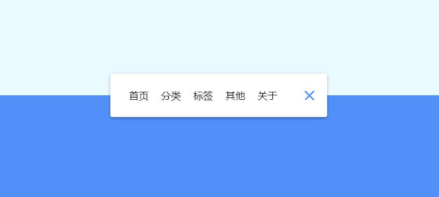
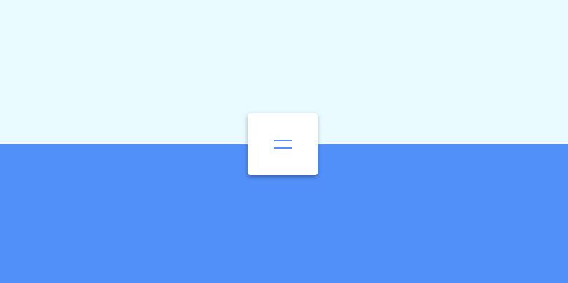
📝实现思路及效果

💻代码
index.html
1
2
3
4
5
6
7
8
9
10
11
12
13
14
15
16
17
18
19
20
21
22
23
24
25
26
27
28
29
30
31
32
33
34
35
36
37
38
39
40
41
42
43
44
45
46
47
48
49
50
| <!DOCTYPE html>
<html lang="en">
<head>
<meta charset="UTF-8">
<meta http-equiv="X-UA-Compatible" content="IE=edge">
<meta name="viewport" content="width=device-width, initial-scale=1.0">
<title>导航栏最小化</title>
<link rel="shortcut icon" href="../logo.svg">
<link rel="stylesheet" href="style.css">
</head>
<body>
<nav class="active" id="nav">
<ul>
<li><a href="#">首页</a></li>
<li><a href="#">分类</a></li>
<li><a href="#">标签</a></li>
<li><a href="#">其他</a></li>
<li><a href="#">关于</a></li>
</ul>
<button class="icon" id="toggle">
<div class="line line1"></div>
<div class="line line2"></div>
</button>
</nav>
<script src="script.js"></script>
</body>
</html>
|
style.css
1
2
3
4
5
6
7
8
9
10
11
12
13
14
15
16
17
18
19
20
21
22
23
24
25
26
27
28
29
30
31
32
33
34
35
36
37
38
39
40
41
42
43
44
45
46
47
48
49
50
51
52
53
54
55
56
57
58
59
60
61
62
63
64
65
66
67
68
69
70
71
72
73
74
75
76
77
78
79
80
81
82
83
84
85
86
87
88
89
90
91
92
93
94
95
96
97
98
99
100
101
102
103
104
105
106
107
108
109
110
111
112
113
114
115
116
| @import url('https://fonts.googleapis.com/css?family=Muli&display=swap');
* {
box-sizing: border-box;
}
body {
background-color: #eafbff;
background-image: linear-gradient(
to bottom,
#eafbff 0%,
#eafbff 50%,
#5290f9 50%,
#5290f9 100%
);
font-family: 'Muli', sans-serif;
display: flex;
align-items: center;
justify-content: center;
height: 100vh;
margin: 0;
}
nav {
background-color: #fff;
padding: 20px;
width: 80px;
display: flex;
align-items: center;
justify-content: center;
border-radius: 3px;
box-shadow: 0 2px 5px rgba(0, 0, 0, 0.3);
transition: width 0.6s linear;
overflow-x: hidden;
}
nav.active {
width: 350px;
}
nav ul {
display: flex;
list-style-type: none;
padding: 0;
margin: 0;
width: 0;
transition: width 0.6s linear;
}
nav.active ul {
width: 100%;
}
nav ul li {
transform: rotateY(0deg);
flex-shrink: 0;
opacity: 0;
transition: transform 0.6s linear, opacity 0.6s linear;
}
nav.active ul li {
opacity: 1;
transform: rotateY(360deg);
}
nav ul a {
position: relative;
color: #000;
text-decoration: none;
margin: 0 10px;
}
.icon {
background-color: #fff;
border: 0;
cursor: pointer;
padding: 0;
position: relative;
height: 30px;
width: 30px;
}
.icon:focus {
outline: 0;
}
.icon .line {
background-color: #5290f9;
height: 2px;
width: 20px;
position: absolute;
top: 10px;
left: 5px;
transition: transform 0.6s linear;
}
.icon .line2 {
top: auto;
bottom: 10px;
}
nav.active .icon .line1 {
transform: rotate(-765deg) translateY(5.5px);
}
nav.active .icon .line2 {
transform: rotate(765deg) translateY(-5.5px);
}
|
script.js
1
2
3
4
| const toggle = document.getElementById('toggle')
const nav = document.getElementById('nav')
toggle.addEventListener('click', () => nav.classList.toggle('active'))
|